


1 more photo
Credits
From Euga Design Studio
THE LAYOUT
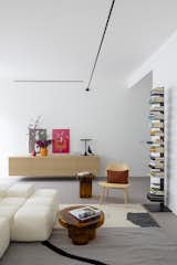
This 90 square metres apartment in the centre of Milan had a not-so-appealing layout, typical of a 1960’s building. With two unusually long bathrooms and a tiny independent kitchen, it had a pretty uncomfortable living room that included the dining area. For these reasons, it was decided to revolutionize the plan by tearing down all the walls and redesigning all the spaces. The minimal style of the project focuses on the essential. The mostly neutral colours enhance the materiality of the wooden elements characterizing the entirely made-to-measure furnishings, with its geometrical and linear shapes. The lighting project is the protagonist, both for its coherence with the architectural project and for the originality of the adopted solutions.
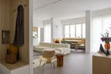
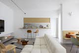
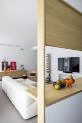
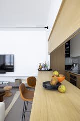
Our clients are a young couple who asked for more contemporary solutions that allow to maximize the living space. We started by focusing on the living room, seen as the heart of the property, where they could have their meals but also work and relax while watching a movie, cooking or enjoying snacks: a place without univocal characteristics that allows for multifunctional use. In order to achieve such result, we went for a basic design, where small aesthetic elements define the undeclared functional zones.
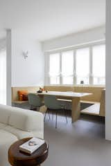
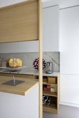
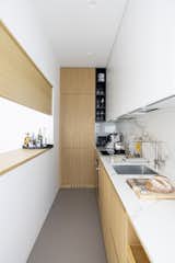
The dining zone is marked by a pre-existing space, a sort of bow window, who allowed us to design a plain-shaped bench that increases the livability of the space. The kitchen was moved into what used to be a quite dysfunctional bathroom due to its position, next to the living room, and size. The kitchen working area is partially hidden by the made-to-measure counter, as per our clients’ request.
The theme of the open plan kitchen overlooking the living room combined with the clients’ request of having a bar corner made us decide to cover the walls with wooden panels and asymmetrical frames that help to rebalance the proportions and prevent the loss of the functions of shield, counter and serving hatch, just like in old fashioned restaurants.
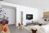
Thanks to the new layout, the living area benefits from a better exposure to natural light, given the increased number of windows.
Due to technical issues, it was not possible to drill holes in the ceiling. Therefore, we studied a lighting project that could compensate for such problem: a light strip was mounted between the walls of the living room, side appliques light the table and a hidden led that provides the perfect light for relaxing moments was put into the niche below the TV set. Finally, a strip led was added inside the wooden paneling in order to light the counter but also to meet the need of formal integrity.
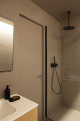
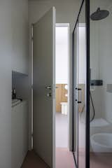
The two bathrooms, one windowless and one with a window, are in the central part of the apartment. One can be accessed from the hallway between the living area and the bedrooms and the other one from the master bedroom. The floor and the walls of both were covered with resin. The guest bathroom is characterized by the “box” effect, given the homogeneity of materials and colours, where the special use of diversified spot light sources enhances the tactile feature of the coverings.
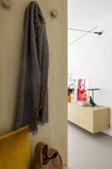
The entrance, once dysfunctional, appears longer thanks to the new layout of the living room. It was possible to equip it with a storage unit and it now represents a true filter.
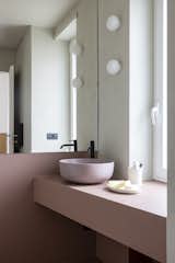
The use of coulors and of geometry in the master bathroom was inspired by a picture by Giovanni Gastel of a bathroom with window in Filicudi. In this case, the colour of the floor partially englobes the sink and a portion of the front wall, thus merging with the wide mirroring area that dematerializes and amplifies the effects. The rest of the walls are of a light grey that also covers the custom cabinet on the right, once again underlining the will to unify and simplify the architectural message.
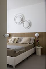
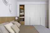
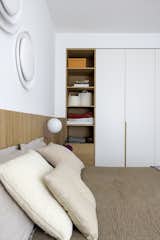
The size of the sleeping area was, as a consequence, slightly reduced and the new layout of the walls allowed us to englobe the wardrobe, white as the rest of the walls but with a durmast open side that provides a sense of continuity with the boiserie and also works as bedhead. Also in this case, given the impossibility to use ceiling lights, 2 big sconces were mounted on the wall above the bed.
MATERIALS
The floors of the whole flat were covered with resin of a neutral rosy colour with red hues. In the bathrooms both floor and walls were covered with resin.
The made-to-measure furniture is of durmast.
REFERENCES
Giovanni Gastel – "È un'isola" (“It’s an island”) is "a tale, a journal full of memories and silent landscapes, in which Giovanni set down his feelings and thoughts ".