A London Terrace House’s Extension Goes Graphic With Pattern and Color
When British architect Mat Barnes, director of Critical Architecture Network (CAN), was approached by a client living in a Victorian terrace house in Brockley, South London, the initial brief was simply to increase light in the kitchen by enlarging the windows. As the conversation progressed, however, Barnes began to compare the cost of this initial request with that of adding a side extension. The clients soon agreed, and the result is a boldly striped addition that plays with both volume and materiality.
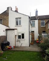
Before the renovation, the house had a narrow and dark kitchen and dining space with little connection to the garden.
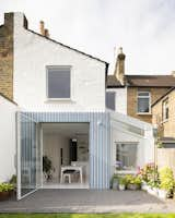
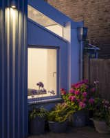
The main volume of the extension is constructed from offset Douglas fir battens painted blue and gray. This reflects the vertical lines and gray color of the ribbed render used in the extension to the side of the house.
The clients had already decorated the front half of the ground floor, but the back half was still home to a dark and narrow kitchen that was crowded with a boiler and utility space. The new extension opened the kitchen up and added another living space, which is used for entertaining and family time. This allows the existing front living room to be used more specifically as a TV room and snug in the winter.
Before the renovation, the kitchen and dining area was narrow, dark. and crowded. This original space was split over two levels: one a rickety timber floor. and the other a badly tiled concrete slab.

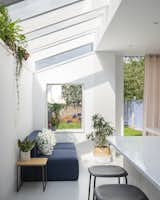
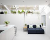
The kitchen features whitewashed Douglas fir joinery with an enamel splatterware worktop by Vlaze on a seamless resin floor by Puur. Plants bring a relaxed feeling to the interior.
The main challenge in the renovation was the low ceiling height in the existing kitchen and a large chimney breast that dominated the space. CAN overcame the low ceiling by lowering the floor level as much as possible, which added over 15 inches of height to the space and created a level threshold with the garden.
"Removing the chimney breast took a bit of structural gymnastics, as we had to support the breast on the floor above as it was connected with the neighbors," says Barnes. "But this was definitely worth the hassle and cost."
The rear extension has increased the use of the garden by making it more accessible.
Barnes wanted to play around with the materiality of the extension, to avoid creating "one bulky mass of brick." So, instead of using masonry, the team treated each element of the extension differently, creating a graphic interplay of pattern and material. "Each volume’s material treatment is on a scale of subtle to bold," explains Barnes.
The side extension features a white-tiled "nib" wall with a galvanized rainwater pipe, light gray metalwork, and a ribbed render.
The existing first floor, made of brickwork, was painted white and fitted with new aluminum windows. The side extension, which is set back slightly from the main elevation, features a light gray, ribbed render with matching metalwork, and the nib wall has been clad in gloss white tiles. "The side extension takes it up a notch," says Barnes. "The textures are important here to emphasize that the color of the render and metalwork matches the windows."
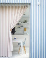
The pink curtain is made from a semi-transparent material, which is visually similar to linen. The client's children like to use it like a "theatre curtain" when playing.
Shop the Look
The boldest volume, which contains a large glass pivoting door leading to the garden, is the visual focus of the extension. The dramatic stripes—which reference the more subtle vertical lines of the ribbed render in the side extension—have been created using offset Douglas fir battens, alternately painted light gray and gunmetal blue. "Because of the large expanse of glass, we wanted to use a striking material to frame it," says Barnes. "We were looking at painted timber buildings in Greenland, which are typically bright block colors. We initially were going to go for a solid blue, but we felt it didn't emphasize the vertical lines enough, so we opted for a contrasting color. There may also be a subconscious British beach hut influence in there somewhere!"
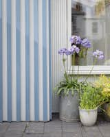
The vertical stripes in the timber part of the rear extension mirror the pattern in the gray render used in the side extension.
A pink curtain—with a wave profile that echoes the vertical lines on the exterior—adds color and texture to the muted interior and acts as shading for the home on hot days. A large, single-pane pivot door allows the space to be fully open to the garden, without mullions as would have been needed with bi-fold or sliding doors. "We wanted to create as seamless a visual connection as possible when the door is closed and for the external and internal spaces to feel as one when the door is open," says Barnes.
"We were trying to create a relaxed interior that allowed the client to make their own mark with furnishings, plants, and pictures," says architect Mat Barnes.
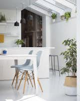
The interior was kept very muted with bright, white surfaces designed to bounce light around the extension. The same glossy white tiles that were used on the exterior have been used to clad a brick pillar and the back of a plant shelf that sits beneath a skylight. The kitchen joinery is whitewashed Douglas fir joinery with an enamel splatterware worktop. Douglas fir is also used for the structural timber fins and window reveals in the side extension. "I enjoy the contrast between the bold exterior and pared-back interior," says Barnes.
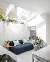
A skylight lets natural light into the extension, and white gloss mosaic tiles on the back of the plant shelf and the column reflect light directly into the space.
The interior of the extension features finishes in muted colors and has been designed to bounce as much light around the space as possible.
"I loved seeing the clients and their children using the new space—especially the children running between the garden and the kitchen through the curtain. The rear extension and new kitchen-diner has made the garden more accessible and become the new heart of the home for the family."
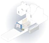
Exploded 3D view of A Brockley Side.
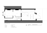
The Ground Floor plan before the renovation
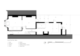
The Ground Floor plan after the renovation
Related Reading:
Before & After: A Cramped Victorian in London Lightens Up With a Double-Height Renovation
A London Town House Renovation Beaming with Personality
Project Credits:
Architect of Record: CAN
Builder: John D Ltd.
Structural Engineer: Symmetrys
Published
Get the Renovations Newsletter
From warehouse conversions to rehabbed midcentury gems, to expert advice and budget breakdowns, the renovation newsletter serves up the inspiration you need to tackle your next project.