A Pair of Backyard Cabins Are Worlds Removed From Their Main Residence—But Only Steps Away
Houses We Love: Every day we feature a remarkable space submitted by our community of architects, designers, builders, and homeowners. Have one to share? Post it here.
Project Details:
Location: Melbourne, Australia
Structural Engineer: C. Ritsikos
Landscape Design: Sam Cox / @samcoxlandscape
Cabinetry Design: Nick Stone
Photographer: Anthony Basheer / @anthonybasheer
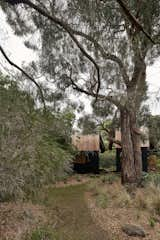
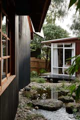
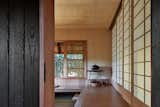
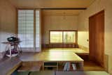
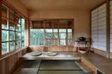
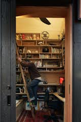
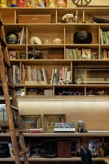
From the Architect: "The clients had extended the house by adding to the existing home. One is a space to work, and the other is a space not to work. The site was a fairly typical suburban backyard but with more of a bush feeling to it rather than a mowed lawn. It was a unique project as it didn’t conform to traditional ideas of ‘extending’ a home. Instead, it was providing two very specific spaces that suited the highly considered requirements of two individuals.
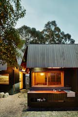
"It was really important that they referenced the Robin Boyd-designed CHI home but did not copy it or borrow from its elements, as the studios had to be placed within a garden rather than perceived as an extension of the house. There was a shared appreciation with the clients around the nature of traditional Japanese architecture, particularly tea houses, and the way they have a very specific function but also the way they are often sited within a garden space. The architects made references and connections previously about the Japanese influence on Australian residential architects such as Robin Boyd.
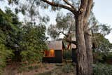
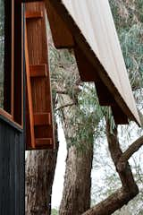
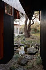
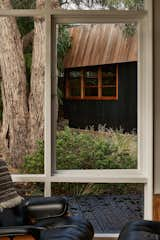
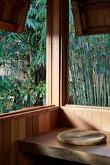
"There is a quiet communication that occurs between the house, the two studios, and the garden. Many perceived and real references, from the lining up of views through the studios to an established eucalypt tree to the construction techniques utilized for the window frames and eaves of the main home.
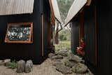
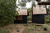
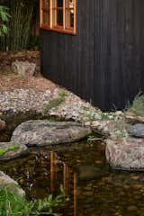
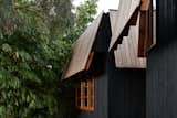
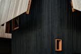
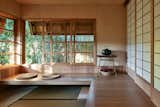
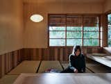
"The external materials are of a very limited palette—just cedar and yakisugi-style burnt ash cladding. Inside the non-work studio, the architects had a lot of fun exploring the very traditional Japanese elements of tatami matting and shoji screens. The challenge was to design for two people two highly specific spaces that best responded to their highly specific requirements. Fortunately, the clients were very engaged and articulate through the design process, taking the time to communicate what was required but also trusting us to interpret those needs into a design.
"The designers loved how the two spaces appeared to be communicating with each other; they each have an individual character to them and a scale that is somewhat difficult to perceive. It’s like they have taken themselves off to the back of the garden so that they can share secrets. One part of the project that is perhaps hard to discern from the photos alone is the cooking/eating/gathering space located around a fire at the back of the studios. It’s a really special space that is created through the placement of the studios, and it feels like you are out camping with friends when in use."
Published
Get the Pro Newsletter
What’s new in the design world? Stay up to date with our essential dispatches for design professionals.
