Long Island Summer Home Gets a Modern Addition
In effect, the 1,400-square-foot house—a simple cypress box elegantly sited on one of the area’s anomalous slopes—is largely unchanged. "We decided to expand it a bit but not to alter the footprint," he says. "The idea was to keep it small and, really, we bought the house because we liked it—we didn’t want to change it."
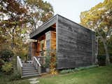
The 1967 beach house—which underwent a meticulous renovation by Bates Masi, the original architect’s firm—is listed as an exclusive holiday rental along the coast of Long Island in New York.
But even the most well-executed design has trouble withstanding the wear and tear of 40 years; if it didn’t need a change, it certainly needed an update. So Dolce and his partner, Jonathan Burnham, made the most logical decision: They hired the original architect to do the renovation.
The exterior, as seen in the 1970s.
Harry Bates designed the house in 1967 for a young family. The modest, light-filled beach home garnered some attention, including coverage in a 1970 issue of House Beautiful. "I can remember it as if it were yesterday," Bates recalls, "the clients coming into my office—a psychiatrist, a German wife, and two preteenage kids. They must have seen something I’d done. It was a very happy experience for me, very pleasant."
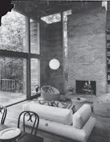
The living room, before renovation.
Bates had worked with Skidmore, Owings & Merrill for many years before leaving to start his own practice, first in New York City in 1963, then inLong Island in 1980. The house is one of many he designed throughout Long Island. Paul Masi—who served as the project architect for the renovation and who was key in maintaining the integrity of the original design—became a partner in Bates’s firmin 1998; he’d worked with Richard Meier for two years after receiving his degree from Harvard’s Graduate School of Design.
Dolce sits on a vintage 1950s couch he found at a thrift store in Asbury Park, New Jersey. Dolce and Burnham had the couch and the Donghia armchair recovered in a stain-resistant Sunbrella fabric by Andrew Grossman Upholstery. The Flokati rug was picked up at a thrift store in Florida. Hanging on the wall behind Dolce is a piece of art by British painter Tom Hammick.
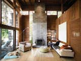
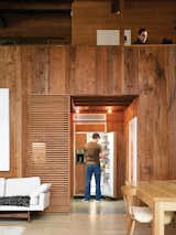
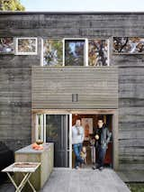
Dolce and Burnham’s main objective was to reorient an awkward staircase that had replaced the original spiral one; it now landed, rather pathetically, in the central portion of the main living area. To open up the room without having to resort to the original space-saving stair, the architects pushed out the south-facing wall five feet, sandwiching a new staircase between the new exterior wall and the line of the old wall. In place of that wall, they inserted a semitransparent slatted divider. This not only refers back to the original structure, it also affords the main living area light from skylights that run along the ceiling above the stairs. This slatted motif is carried throughout the interior (into the kitchen) and exterior (with the deck gates and safety railings), making the intervention seem almost endemic.
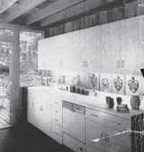
The kitchen before renovation.
Reusing material made the update so seamless asto be invisible, although Dolce will tell you that this almost imperceptible difference belies the cost and time it took to achieve it. The couple’s contractor, Paul Cassidy, reused all 12-inch cypress boards from the old deck and former south-facing wall, carefully stripping and recutting each one to serve as the predominant building material for the renovation. "There’s a nice character in all the wood that’s here," explains Masi. "When you’re adding new elements it can be hard to maintain that, and by recycling a lotof it we updated the house but kept it in the same vernacular." The aged wood provides uniformity to the cypress, which permeates the overall home experience—even down to the sense of smell.
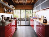
This sleek kitchen in the renovated Dolce and Burnham Residence hits warm notes with red lacquered cabinetry, cypress woodwork, and a leafy backyard vista.
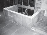
As for structural updates, the architects were able to fit the bulk of their changes within the addition’s compact 250 square feet. The downstairs bathroom, for instance, which both the residents and architect recall as being more like an outhouse than a modern commode, was fully revamped.
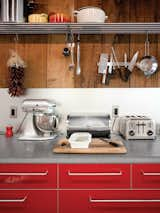
Harry Bates designed this simple cedar house for a young family in New York in 1967. Forty years later he updated the place for its new owners, Joe Dolce and Jonathan Burnham. The addition of bright red cabinetry in the kitchen introduces a contemporary style without losing the rustic, vintage quality of the space. Read the full article here.
"You have no idea what it looked like!" exclaims Dolce. Masi adds, jokingly: "It was a summer house. You know, you’d probably just get in and out as quickly as you could."
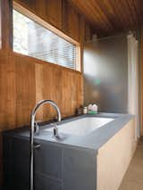
The extra space from the stairway addition allowed for an equally wide, handsome blue sandstone shower. The blue sandstone, which hails from northern New York, is one of three elements the couple chose for their minimal palette. The patio, kitchen, and bathroom run together along an east–west axis, each room bearing a different finish of the same blue stone. This allows for a subtle contrast in texture, but it also carries the overall theme throughout the space, making it feel more expansive yet sharply defined.
They decided to keep the hardwood floors oak but had to add an extra layer on top of the old floor in the living-dining area so that it would lie flush against the new tiling in the kitchen (which was remodeled with Ikea components). This was one of the only "unforeseen expenses" that Dolce recalls—though, he adds positively, they were lucky that the disparity was exactly three quarters of an inch, making it a relatively inexpensive fix. When asked about the origin of the racks in the bathroom, he chirps, coyly, "Cheap, cheap, cheap…They’re old train luggage racks—found them at a yard sale for $50." Dolce seems to remember the price and origin of almost every detail in the house.
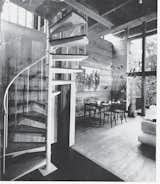
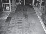
A shot of the former spiral staircase.
Additionally, the house’s sliding glass doors were replaced with custom brushed-aluminum sliders, although the frameless glass window—arguably the most distinctive element of Bates’s original design—remains the same. It serves as a simple clerestory to the upper and lower levels of the house. "At a certain point, we started to run out of money," explains Dolce, "so we put the money into the elements—into the stone, the wood, the glass." The master bathroom received a simple update and reorientation, which added a new bathtub and fixtures. They also updated the vanity, whose mirror slides to the side, permitting a view into the bedroom. "You have all sorts of possibilities for voyeurism in this house, which is exciting—depending on who your guests are," Dolce quips. "But usually it’s just my mother."
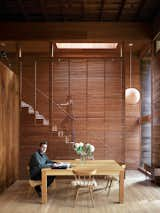
Dolce sits at the dining-room table in front of the elegantly slatted cypress divider, which separates the living space from the new staircase.
Indeed, any slickness in the renovation is mediated by the house’s humble form and materials. As Bates describes it: "It was built at a period when budgets were so low that we couldn’t afford things like entrance halls—I didn’t want to waste the space. The materials are very basic: brick concrete blocks, rough-cut cypress with tongue-and-groove, and shiplapping construction." When all is said and done, the difference isn’t great.
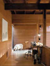
The office space is situated above the loft and is illuminated by Jielde steel lamps from France, which Dolce collects.
"You know, at the end of it, we looked at the house and we thought, Wow, we spent a lot of money!" says Dolce. But, he adds, "None of the details are hidden, and that’s actually what makes it expensive. All these seams have to be perfect, and, if they’re not, you’re going to see it." The mastery of the renovationis its relative invisibility. The simplicity of the program was handled with a slight and embracing hand. In the end, what it is turns out to be exactly what it was: a timeless vision.
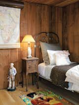
A guest bedroom is furnished in a quaintly quirky fashion.
Burnham and Dolce picked up a petite but deep bathtub, which fits perfectly in the modest master bathroom upstairs.
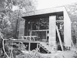
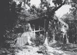
The exterior, shown in a 1970 photograph.
The patio is also equipped with a generous workspace. Bates’s original fenestration, which failed to meet current building code, has been brought up to safety standards by employing the same slatting motif used elsewhere in the house.
Published
Last Updated
Get the Renovations Newsletter
From warehouse conversions to rehabbed midcentury gems, to expert advice and budget breakdowns, the renovation newsletter serves up the inspiration you need to tackle your next project.