Jason Pontius on Blog Themes
The word "blog" is, I think, on its way out of the lexicon. It's simply too hard to define anymore. Blog software is used to manage content for all kinds of websites, blog and non-blog; if the definition of a blog is "a website updated regularly, with the newest content at the top," that applies to just about any modern website.
As the blog has become a more generic and generalized form of web content presentation, the role of a "theme" has evolved too. In the old days, a "theme" was essentially a color scheme for the software you were using. (You can see the residue of this notion of theming in the absurdly irrelevant set of default themes offered by Gmail.)
The software people use to blog has evolved too. There are a handful of popular blogging tools, but the three we're looking at today— Blogger, WordPress and Tumblr— represent distinct evolutionary steps in the way we think about blogs, and Web sites, in general. They correspond, roughly, to yesterday, today and tomorrow.
Blogger
Blogger was one of the first popular blogging platforms, and its theming (called "templates," usually, in Blogger) represents a pretty primitive approach.
MinimaMinima probably did more to define the popular conception of "what a blog looks like" than any blog theme in history. Along with the other themes made available with the 2004 redesign of Blogger, Minima established a standard—not just for design, but for content and functionality—that has persisted essentially unchanged until the birth of Tumblr.
For a relatively primitive design theme, Minima's header is iconic and excellent. When Blogger was redesigned in 2004, "whitespace" was a relatively new concept; the notion that you'd set your blog title inside a bounded white box with plenty of padding was pretty innovative.
Because Minima was the first option listed in the choose-a-template page on Blogger, thousands and thousands of blogs were created with Minima, and you can still see its residue all over the place.
And many blogs that don't look anything like Minima—like our blog for the Kenyon College redesign, for example—were heavily modified from a Minima foundation.
WordPress has its Minima as well—in this case called Kubrick—and everything you need to know about Kubrick can be found in the Huffington Post article, The Secret History of Kubrick, the Blog Theme That Changed the Internet.
Although WP was originally an alternative to Blogger—the choice between myblog.blogspot.com and myblog.wordpress.com was kind of academic—it's evolved into a much more robust content management platform. (The Wheaton College site is built entirely in WordPress, for example.)
The use of themes in WordPress, and their ambition and scope, has evolved accordingly. While Blogger's themes are primarily "skins"—superficial looks applied to your conventional blog posts and links—the best WP themes constitute genre-independent ways of thinking about site design and organization. Here's a few noteworthy ones.
A company (group? collective?) called Mono-Lab—about which I know very little, because their site's in Japanese—makes three WordPress themes that, while similar, are all quite beautiful and distinctive. They're not necessarily total mold-breakers—the expected elements are generally in the expected places—but they just look fantastic. They all use the screen real estate very well, but maintain plenty of white space and little details (like the dates in Monochrome) that really set them apart.
Monochrome
Piano Black
Neutral
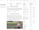
Basic Maths is designed by Khoi Vinh, whose name is probably familiar to anyone interested in Web design—he's the lead designer of nytimes.com and his blog, Subtraction, has a very influential design.
What I find interesting about Basic Maths is its approach to the standard blog navigation elements—archives, top posts, browse by tag, etc. That navigation scheme has been around since the beginning of the blog era, and can feel dated; for most blogs, I don't particularly need to search posts for particular topics, or see what you wrote in June 2006. But in Basic Maths, that metanavigation is lifted up and celebrated: it's really the whole point of the design. There is navigation everywhere; it's an incredibly information-rich design that— primarily through the use of a neutral color palette—doesn't feel cluttered. And there's a very bright, sharp mouse hover state that makes the interface (relatively) easy to navigate.
This theme wouldn't work on your run-of-the-mill cheesecake-of-the-day blog. It's for deep, well indexed blogs that have been around for a while. But it's certainly something to look at.
Basic Maths demo
Although the ultra-minimalist blog template has become widespread thanks to Tumblr, photo-driven WP templates aren't as common. Big Picture is noteworthy primarily for its huge background photo (customizable on a per-page basis, I believe) as well as a certain degree of disrespect towards typical blog conventions.
Tumblr
Tumblr is something else entirely— I guess it's the first blogging software of the post-blog era. It's weird to call many Tumblr blogs blogs at all— they're more like collectiions, either of various things the author finds interesting or one thing the author pursues obsessively.
The meta navigation that has long seemed a necessary part of the blog interface is an afterthought, if not dispensed with entirely, in Tumblr. Tumblelogs are meant to be viewed now, and if you're looking for something past, that's what the search box is for.
This focus on the content— to the detriment of everything else— opens up huge opportunities for designers, and Tumblr themes don't feel like templates or skins or even "themes" at all— they're just Web designs, and some themes have some of the most striking designs on the Internet. There are hundreds of great Tumblr themes out there— here are just a few I particularly like.
The Field Notes theme is inspired by the Field Notes series of notebooks, itself a fascinating design project. It's great to see print influencing the Web in a way that feels authentic and interesting. And although I tend to really dislike using Futura, especially on the Web, it works here.
SolarisThere are quite a few Tumblr themes inspired by film poster design—Vertigo is another good example—but I like Solaris for its clean lines, excellent iconography, and its creative use of whitespace. (Lots of Tumblr blogs wind up as single-column, relatively narrow strips—Solaris uses that marginal space really well.)
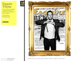
EsquireOne of the best things about Tumblr themes is that they include options for skinning audio posts, images, and video. Esquire is a stylish theme that includes one of my favorite design details on the Web—all image posts are set in a big, gaudy, gilded picture frame. That's the sort of detail that would have been unimaginable to the creators of Blogger.
Published
Last Updated
Get the Dwell Newsletter
Be the first to see our latest home tours, design news, and more.


