This Tokyo Apartment’s Kaleidoscopic Kitchen Delights With Cotton Candy Colors
There were only two colors that were off-limits: black and red. When designer Adam Nathaniel Furman began working with the couple who live within this kaleidoscope, they told him that those two shades were too harsh for the palette they had in mind—they were looking for hues that would achieve an unconventional sense of calm.
Prior to this bright renovation, this apartment hadn't been renovated since the 1980s. It was a cramped space that centered around the kitchen, in which Furman remembers as "a very dark, depressing place."
"Both of those colors are too aggressive, and would damage the all-encompassing coziness of the interiors," Furman says. When he met the owners through friends in Tokyo, everything about their surroundings was muted. The pair lives in Nagatacho, a conservative part of the city near the government district, where there's plenty of trees but lots of quiet. Their apartment building was built sometime in the 1980s, and hadn't been updated since.
"The home used to be organized around a long, thin corridor," Furman remembers. "There were many rooms, and all were pokey and small. The corridor had no light, and the ceilings were extremely, claustrophobically low. The beams are deep, and the ceilings were hung below them, so every room had about six feet of space."
"We went through numerous palettes and found that pastels, punctuated by moments of bright saturation and natural materials, imbued the spaces with joy," he says.
Furman refers to the original apartment as a cramped rabbit hole complete with heavy drapes and windows that struggled for light. The owners envisioned something open and bright for their three bedrooms and two bathrooms, a setting that would intrinsically welcome their family and friends whenever they came to visit. But they didn't want to follow a common interpretation of what "light-filled" might mean in modern design. The pair sought a home where the rooms had an identity of their own.
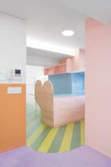
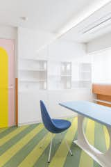
The plan started in the kitchen, which would be a hub that all other rooms would center around. Furman and the owners created a palette that he refers to as a "spring morning," comprised of lilac, blue, green, and pink in a range of matte and shiny finishes. The various colors would spill across the kitchen's many textures, creating a contrasting harmony that would set the tone for the rest of the apartment.
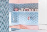
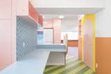
The design's color blocks are contrasted by the herringbone pattern of the backsplash, which still works with the pastel palette.
Shop the Look

"We wanted to balance natural, hand-crafted materials, like ceramics and wood, with artificial ones like linoleum, Corian, and nylon," he adds. "The clients initially called the design a 'bubblegum flat,' but as it evolved, they called it the 'watermelon flat,' which is because of the colors in the kitchen."
Given how complicated this design is, it's intriguing to look at the kitchen and still feel the owners' initial goal of a subjective calm. How exactly did Furman wrangle these shades into a format that the eye can follow?
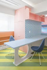
This long surface in the kitchen can act as a meal table or a prep space. Furman and the owners envisioned the kitchen as the center of a home that would have many visitors.
"The first thing we did was create a datum line at about 47 inches, above which everything would be covered in white wallpaper," he says. "Below this would be the beautifully textured polychromatic wallpapers on panels, so your eye is drawn to the warmth and color below, while everything above simply reads as 'light.' This allows the space to be bright but warm at the same time, and also allowed us to raise the ceiling level wherever we could."
White was used strategically to counteract the palette's many colors. Furman used a datum line at about 47 inches that would help draw the eye throughout the kitchen and the rest of the home by using white space above that border.
The optical illusion of shapes and colors succeed at concealing the apartment's many beams, while also accomplishing the light-filled feel that the owners were after. Now the home is no longer a shadowy rabbit hole, but a place that appears like a blooming garden where this furry animal might roam.
"It was a difficult balance to achieve," Furman says. "But it's a joyful atmosphere."
Related Reading:
This Candy-Colored Apartment in Tokyo Looks Good Enough to Eat
Interior Design: Adam Nathaniel Furman
Published
Last Updated
Get the Renovations Newsletter
From warehouse conversions to rehabbed midcentury gems, to expert advice and budget breakdowns, the renovation newsletter serves up the inspiration you need to tackle your next project.