Dostoyevsky, Meet Mendelsund
I recently picked up a copy of Richard Pevear and Larissa Volokhonsky's wonderful translation of War and Peace. I liked it so much—not nearly finished with those 1200 pages yet—that I began hunting down other big works of Russian lit they've done. And through that little search I came across six clever reissues of Dostoyevsky from Vintage books. Pevear and Volokhonsky helm the translation and the jacket design is by the estimable Peter Mendelsund, an in-house designer at Knopf. I've been a fan of his jackets for a while, but got in touch to pick his brain about his graphic translations of not only Dostoevsky, but a whole host of novelists and thinkers.
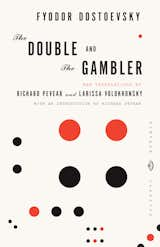
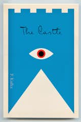
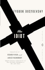
Were you given this sextet of Dostoyevsky titles all at once to design as a piece, or did you get them one at a time?The mandate was to design The Idiot as a stand-alone. So, after The Idiot was approved, I had to go on bended knee and pitch the idea of re-jacketing the other Dostoyevsky's to Vintage’s editorial staff (for some reason, nobody ever seems to come to me with the idea of designing a complete backlist; it’s always a one-off title, followed by me pathetically begging somebody to allow me to design the rest.) The remainder of the Dostoyevsky books trickled in as stock on the particular old titles needed refreshing. It took probably two years to have a complete group on my shelf.Tell me about the general idea behind this set. Why this brand of abstraction, and why such a limited color palette. You wouldn't call Dostoyevsky a modernist, nor was he a particularly abstract kind of writer. Why this treatment for his work?At the time I was designing these, I was feeling pretty strongly that book design had skewed too far in the direction of literalism and over-specificity. Most jackets and covers of the time were photos, many showing characters, settings. This was a trend that I felt harmed the imaginative process of the reader- I’ve always appreciated book covers that are suggestive of a book’s content without preempting a readers privileged relationship with that content. I guess what I’m saying is that these covers speak more to my own biases at the time than to anything specific in Dostoyevsky’s writing. (Though I would strongly dispute the assertion that he was not a modernist.) Did the translator Richard Pevear, who I adore, have any input?I spoke with Richard Pevear when I first began work on these, and the first thing out of both of our mouths was a strong mutual desire to avoid the normal Russian lit clichés: no fields of wildflowers, no socialist realism, no sleighs or wintry wonderlands, and most importantly no paintings or photos of characters. This constructivist aesthetic, anachronistic as it is, does a pretty good job I think of scouring Dostoyevsky clean of these kinds of metaphoric accretions.Does Vintage have plans to do any more of their work on Dostoyevsky?Not that I know of- though we are constantly releasing new translations of P&V’s (Dr. Zhivago just came out in hardcover, which I jacketed; the Tolstoy stories came out fairly recently, and there are definitely other Ruskis in the pipeline).Does bringing out a set of classics from a classic author under one, unified jacket aesthetic really work in the marketplace? Can you really seduce someone into buying such a known quantity (like Crime and Punishment, say) by putting a new jacket on it?Well, I can only speak to this anecdotally, but, if the personal response I receive (for say, the Dost’s, the complete Foucaults, or the recent Kafka repackaging) is any indication, these designs truly galvanize the reading/buying public. I feel pretty confident money is being made here. And I would also say that redesigning the sets has brought out the completist in people. Readers really tend to want all of them. Which is gratifying. And, in any case, I keep getting asked to design backlist titles, so that must mean something.You mentioned that you've got an assignment to do a set of covers for Kafka, whose work I might more easily peg to the covers you did for Dostoyevsky. What have you got planned for our vexed Czech?I think, Aaron, for the sake of time, I’ll just direct you to the blog post on these which says pretty much everything I feel about our vexed Czech. Why does Knopf keep farming you the difficult Eastern Euros to design? Walter Benjamin, Franz Kafka, Thomas Bernhard? You depressed, Peter?Yes- deeply. Depressed enough that I actually requested to work on every one of these authors. I clearly need professional help.