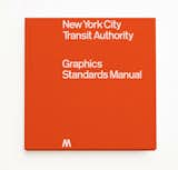
NYC Subway Graphics Manual Gets Reissued
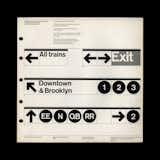
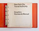
For much of the twentieth century, the New York City subway system was seen as a terrifying place—often compared to a lurking, underground monster where crime was rampant and rats roamed. It didn't help that there was no sense of structure behind the system—even the signage was made up of a mishmash of fonts, and handmade lettering was not uncommon. In 1967, the New York City Transit Authority (soon to become part of the MTA) hired Massimo Vignelli and Bob Noorda of the design firm Unimark International to create a graphics system that would give the subway a uniform language across its many, crisscrossing lines. Now, graphics fans can rejoice: a Kickstarter campaign will bring the guide back to life in the form of a full-size reissue, available if you pledge before October 9, 2014.