13 Tried-and-True White Paint Colors Recommended by Pros
Pro designers know their whites—better yet, they know that the perfect shade can bring it all together. While navigating the countless possibilities, Bogdan Tomalevski of Colega Architects in Culver City, California, says the discussion around the perfect shade comes up a lot with clients.
"With the number of options there are in the white range, we choose to introduce hues of warm or cool tones depending on the project," he says. "Although the color will be experienced as white, the hue does make a significant difference."
Tomalevski's preferred shade of white, White Picket Fence from Dunn Edwards, blends seamlessly with various wood tones and textures.
For those currently weighing the options, trusted recommendations from a group of talented architects may offer some peace of mind. Read on (and bookmark) this guide for a more enjoyable selection process.
Benjamin Moore, Swiss Coffee
Alexander Jermyn of Alexander Jermyn Architecture LTD in Berkeley, California, selected Benjamin Moore's Swiss Coffee for the TP-H Residence in Palo Alto. "The exterior white was carefully chosen to make the surfaces appear bright white in sunnier conditions but then provide a more nuanced, richer white in overcast light or shadow," he says.
Benjamin Moore's subtle shade, Swiss Coffee, complements the addition's clean lines and natural surroundings.
Benjamin Moore, White Dove
For the project's spare interior, Jermyn chose Benjamin Moore's popular shade, White Dove. "The interior white strikes a balance between not being too cool or too warm," he says. "It is very conducive to accept prints or bolder artwork as a neutral but inviting background."

Inside, Benjamin Moore's White Dove works well with the serene, contemporary atmosphere.
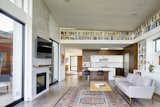
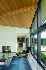
Sherwin Williams, High Reflective White
Architect Josh Manes of Josh Manes Architecture chose High Reflective White by Sherwin Williams for his contemporary residence in Westhampton Beach, Long Island. "We wanted a clean feeling throughout the house and a real true white with no yellow undertones," he says. "There's a slight hint of warmth to this color, so while most stark whites can leave a home feeling cold, this one brings a lot of comfort to the modern space."
High Reflective White by Sherwin Williams directs the eye up towards the home's cedar ceiling and out to expansive views.
Benjamin Moore, Mountain Peak White
Eric Haesloop of Berkeley’s Turnbull Griffin Haesloop Architects recommends Mountain Peak White by Benjamin Moore. "We like the way the white highlights the simple agrarian forms, and on the inside, the way the white walls reveal the changing light throughout the day," he says.
For the firm’s Hupomone Ranch project, Haesloop turned to Mountain Peak White for both the exterior and interior spaces.
Dunn Edwards, White Picket Fence
Bogdan Tomalevski of Colega Architects selected White Picket Fence from Dunn Edwards for a library/living room with expansive views. "It has warm tones that complement the natural walnut cabinetry," he says. "The project also has matte white cabinetry, and we wanted to differentiate between those two materials and colors. Most people may not cognitively notice this intricate selection, but there is a subconscious factor that we as architects believe is inherent in all color theory decisions we make."

Tomalevski utilized a velvet finish for the walls, flat for the ceiling, and eggshell in the bathrooms for subtle variation.
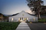
Benjamin Moore, Chantilly Lace
Architect Amy Alper, principal of Sonoma-based firm Amy A. Alper, chose Chantilly Lace for the exterior of this picturesque vineyard farmhouse. "Chantilly Lace is among the most neutral of whites I have found (without red, blue, green, or yellow undertones) and so fully set off rich tones of the deep bronze door and window frames," she says.
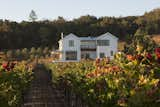
A crisp white accentuates the home’s exterior siding, natural beams, and surrounding vineyard landscape.
Benjamin Moore, Cotton Balls
Alper's Sebastopol Hillside Residence features two different shades of white to complement the room's wood finishes. "Cotton Balls has a creamy warm undertone that harmonized with the bleached oak floor and rift white oak cabinets," she says. "The ceiling was painted the lighter brighter tone in the series, Mountain Peak White, to further bounce the uplighting in the space and set the ceiling off from the walls."
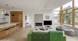
To reflect light around the space, Alper chose a bright white for the open concept ceiling.
Benjamin Moore, Simply White
"Simply White is a perennial favorite in our office, frequently used both on the interior and exterior of our residential projects," says Jeff Guggenheim, principal architect of Guggenheim Architecture and Design Studio in Portland, Oregon. "With a hint of subtle warmth, it complements the Northwest native wood species we so often highlight in our work."

Benjamin Moore's Simply White shines beside minimalist tile and soothing wood textures.
Benjamin Moore, White Wisp
Greg Howe and Pam Lamaster of Chicago architecture firm Searl Lamaster Howe chose Benjamin Moore's White Wisp for a contemporary, linear facade. "Selecting a white for a home's exterior in an area with a climate like Illinois can be a challenge," Howe says. "White Wisp was used on this project because it is a subdued hue that looks equally good on a cloudy winter day as it does in full sunlight in the summer."

White Wisp, described by Howe as "not too blue, not too yellow," highlights the landscape design and exterior textures.
Benjamin Moore, Cloud White
Inside, Howe and Lamaster selected Benjamin Moore's Cloud White. "Cloud White is a versatile color in the sense that works well with both warmer and cooler tones," they say. "It will still read as a true white regardless of what other colors are in the same space."

"It is a great solution when the goal is to use the same white house wide or in open-plan spaces with varied conditions," Howe says.
Sherwin Williams, Snowbound
Dallas-based Architect Michael Gooden of M Gooden Design recommends Snowbound by Sherwin Williams. "Snowbound is a soft, natural white that works well when paired with natural materials and organic elements of the design," Gooden says. "It takes on the warmth of its environment while still presenting a crisp expression on level-5 finished walls."
"We love Snowbound, and we are never surprised when we specify this color and show up on the job site to review, and that’s a very good thing," he says.
Benjamin Moore, Simply White
For Risa Boyer, Principal of Risa Boyer Architecture in Portland, Oregon, Benjamin Moore’s Simply White is a tried and true favorite. "It’s really important for paint colors to look good in all different lighting conditions," Boyer says. "Simply White stays true to its color."
"It is crisp and clean with a hint of warmth," Boyer says of Benjamin Moore's Simply White.
Benjamin Moore, Oxford White
Montréal’s Justine Dumas of Appareil Architecture chose Oxford White by Benjamin Moore for interior surfaces of the Grand Pic Chalet. "This color was chosen because it goes well with wood, and it brings out a warm light without being too yellow," Goulet says. "It is also the perfect balance between bright and warm in order to go with the forest and the trees that surround the house."
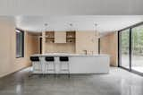
Oxford White balances natural tones and textures while leading the eye out into endless forest views.
Published
Last Updated