
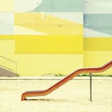
Color Me Mad!
Copyright by Matthias Heiderich
Yolo Colorhouse / Paints
Poster-sized sample swatches, a host of attractive colors, and nontoxic paints let pint-sized paint company Yolo Colorhouse handily compete with their mega-sized corporate competitors.
The materials palette that I chose is light in color with a few splashes of color. This lightness holds the space open and gives it a contemporary feel.
The tiles range from $10 to $22 per square foot.
Hella Jongerius / Jongeriuslab in Berlin
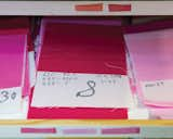
The recipe for each color is attached to its corresponding fabric swatch, and after the designer chooses the right combination, the recipes are sent to the color kitchen. Some colors, such as beige and gray tones, are more difficult to produce than others; turquoise is notorious for sticking poorly to fabrics. "We have our trade secrets that ensure that the colors work," says Anu-Mari Salmi, the production manager.
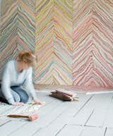
Marbelous Wood by Snedker Studio. Danish designer Pernille Snedker Hansen’s custom installations involve treating local Nordic wood with a marbling effect in toned-down hues.

The classic Heath shallow salad bowl gets a fresh look in Poppy, a limited-edition Summer Collection 2012 color.
Polychromie Le Corbusier by kt.COLOR
Produced with the Le Corbusier Foundation, this historically faithful swatch of 81 hues was sourced from the architect’s own wallpaper samples, paint chips, designs, and storied investigations into the essence of color.
Images by Raw Color hang in a room upstairs.
"When I was getting my master’s in industrial design, color was what I always had the strongest response to. Color affects light, and therefore it affects how we perceive space and form. It’s integral to design."
Just Glaze
Double-glazed windows are typically composed of two layers of glass with a layer of air in between. You might spend more on them upfront ($200–$1,500 each), but the extra insulation can save loads on your heating bill and more than recoup your investment over time. weathershield.com
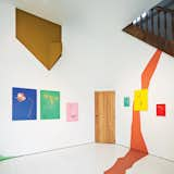
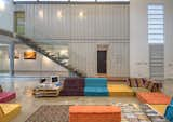
The house has many unexpected splashes of color, and exposed industrial materials are used throughout. The diamond-plate steel shown here was also used as a kitchen backsplash, covered with a coating of pink paint.
Paper installation (2013)
For an installation for the Japanese paper manufacturer Takeo, architect Emmanuelle Moureaux suspended 840 pieces of paper in a spectrum of 100 colors.
Pantone just released their lineup of fall colors.

The colorful Watch Me Wall Clock was designed with creative people in mind. Inspired by a fanned color swatch, the clock has a decidedly cheerful disposition.
Furnished with vintage Eames chairs, a second-hand sofa, and pendants and tables designed by Nathalie, the space is kept purposefully casual. She painstakingly mixed and tested the paint for the mustard-yellow walls herself—15 times—to match the hue of a Kvadrat textile.

Colorful pompoms in all the vibrant colors found throughout the fair.
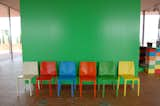
The bright-green hue of this wall, seen just inside the entrance, was used as a complementary color throughout the property.
Vignettes of contrasting colors, materials, and shapes frame every corner. A one-of-a-kind chair by Peter Shire sits in the hallway; near the sculptural staircase is a sconce for Yamagiwa and a sterling silver centerpiece for Memphis, both by Sottsass.
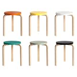
A true icon of functionalist furniture design, the Stool 60 was originally designed by Alvar Aalto for Artek in 1933. Notable for the distinctive bend in the legs, the stool became a signature of Aalto’s work, as his subsequent furniture designs feature these defined leg bends. This Anniversary edition was released in conjunction with the design’s 80th birthday in 2013.
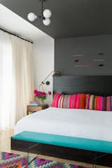
The bed in the master bedroom is a custom JHID design in ebony-stained fir. Lighting is kept subtle, in the form of an overhead fixture by Schoolhouse Electric and wall sconces by Workstead. The arrows are by Fredericks and Mae.
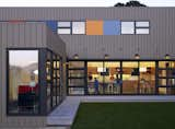
Here's another doozie on the Marin County Tour, the Portnoy Danzig Residence by Sharon Portnoy Design. I like the blocks of color interspersed with the windows on the upper floor, giving the house a playful feel, as though it were a child's toy.
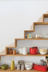
Restorick also built this quirky oak staircase with open shelving along one side. "I use accessories as the color in spaces," says Tyler, "so these items are an integral part of the overall design."
Danes surround themselves with bright colors and beautiful items, as they spend much of their time at home due to the country's high cost of living and its lengthy winters.
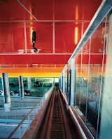
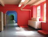
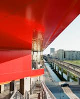
The halls connecting the garage to the residences are covered in brightly painted aluminum treatment associated with cars, not buildings. The colors move, symbolically, from earth to sky: green, yellow, orange, dark orange, hot pink, purple, bright blue. "Buildings are never brightly colored," says Ingels, explaining the thinking behind this stepladder rainbow, "but cars often are."
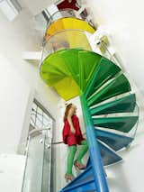
"The staircase is the hub, the soul of the project," Rogers says. "It’s meant to be enjoyed." From the ground, the steps start with the cool colors of the earth, then get warmer as they reach up to the sky.

#shippingcontainer #modern #costarica #casaincubogallery #trejos #reused #recycledmaterial #shippingpallettable #pallettable #beds #recycledplastic #couches #interior #lounge #seatingarea #stairs #glass #color #arearug #art #architect #mariajosetrejos #modernlines #liveworkspace #guachipelin #sanjose #metal #tropical
Published
Get the Dwell Newsletter
Be the first to see our latest home tours, design news, and more.