A Mix of Storage Solutions Steals the Show at This Renovated London Flat
Houses We Love: Every day we feature a remarkable space submitted by our community of architects, designers, builders, and homeowners. Have one to share? Post it here.
Project Details:
Location: London, United Kingdom
Structural Engineer: Elliott Wood
Photographer: Richard Chivers / @richchiversphoto
From the Architect: "A two-story apartment in Stoke Newington, London, has been transformed by Studio Merin through a careful rearticulation of the layout and thoughtful allocation of designated storage spaces to minimize clutter. Titled Maison Pour Dodo (House for Sleep), the brief of the client was to create a soft feeling apartment that would minimize material anxiety and visual noise through well organized and designated storage, calming colors, and soft edges.
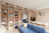
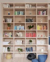
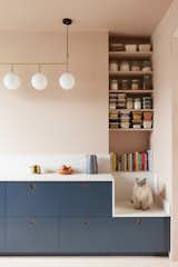
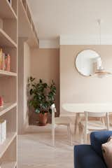
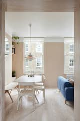
"Studio Merlin’s response was to create a ‘spectrum of storage compression,’ allowing easier management of the home and with it an ability to better control the look, feel, and use of spaces. At one end of this spectrum sits highly compressed storage for infrequently used and mostly hidden domestic objects, whilst at the other end of the scale is the on-display curated Douglas fir feature bookshelf, which serves as a curated art piece itself.
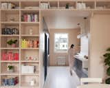
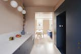
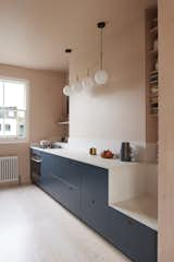
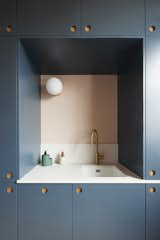
"The full height Douglas fir bookshelf sits as the curated focal point of the apartment, perpendicular to a wall of deeply compressed kitchen cabinetry, integrated appliances, a sink, and a discrete door through to the stairs. The use of concealed Ikea framework with the color blocked Reform CHP fronts freed up a portion of the budget to raise the specification elsewhere.
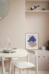
"On the other side of the kitchen is a low level bank of units providing ample storage and food prep countertop space above, bookended by recesses adjacent the chimney breast that provide a clear visual indication of kitchen stock inventory, as well as a seat from which the user can be simultaneously present in both the kitchen, dining, and living room. Read vertically, the kitchen base units, concrete countertop style, and plaster-colored paint above create a palette of pastel color blocking that continues through the first floor to provide the French owner with a sense of familiarity.
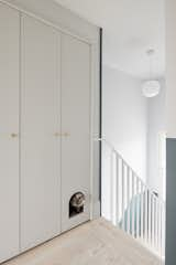
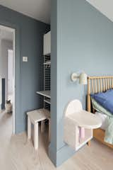
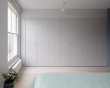
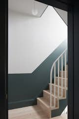
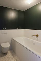
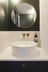
"At second floor level, a chunk of the primary bedroom has been removed to include an additional bathtub for relaxation in the newly expanded and calming bathroom next door. A private temporary work niche provides a valuable escape option for when working from home calls clash, without dominating the primary bedroom. Built-in wardrobes sit seamlessly in the room, concealing material things and creating a minimal and relaxing environment for sleep. On the second landing, new understated and integrated joinery has been added, giving the owner’s cat his own private sleeping and sanitary quarters.
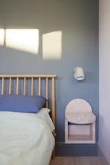
"Curves adorning custom made bedside tables (made from Douglas fir offcuts and designed by Studio Merlin) bookshelf props, stair balustrades, and kitchen backsplashes soften details throughout. The living room orientation and decoration has been devised around the use of a home projector to create a TV-less space that doesn’t feel dominated by consumer electronics."
Published
Get the Dwell Newsletter
Be the first to see our latest home tours, design news, and more.
