A $100K Revamp Lifts a London Victorian to Memphis Heaven
When Tamsen Chislett and her husband Max Lines decided to renovate the lower ground floor of their Victorian terrace in the London borough of Islington, the brief to Office S&M was simple: they weren’t to use gray anywhere in the home. The result is a joyful mash-up of vibrant color and bold architectural forms that is at odds with the grayness so often associated with London.
The furniture and colors both separate and connect the playfully divided plan. Office S&M used these elements to frame views across the room and create an architectural dialogue between the inhabitants and the furniture "characters."
Instead, it evokes the beach huts of South Beach Miami or the playful approach of the Memphis Group. "The name of the project, MO-TEL, is linked to this sense of escapism," says Catrina Stewart, cofounder of Office S&M. "The couple wanted the space to make them feel like they were on holiday."
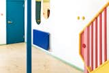
A single blue column divides the space, with the teal entrance to the left. The two tinted gold mirrors are strategically placed to reflect light throughout the space and create moments of surprise. The bright blue radiator turns a pragmatic utility into a statement feature.
Prior to the renovation, the lower ground floor housed the kitchen and a bedroom. A structural wall divided the two spaces, and there were issues with rising damp and a lack of natural light. "The structure itself was in okay condition, but it was very beige and lacked personality," says Stewart. "Max and Tamsen felt that it didn’t really represent them. They wanted to put their personalities and character into it—and they wanted the space to look good when it was messy!" With two young children, it was also essential to select a robust and durable material palette.
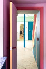
From the utility room, a gold-tinted mirror reflects a distorted view of the space, offering moments of surprise and delight.
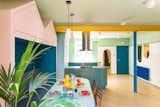
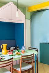
A palm sits in the corner of the dining space, near a glazed door that connects the interior to the garden. "In summertime, they can open the door and it almost feels like the dining table is outside," says architect Catrina Stewart.
The renovation covers the lower ground floor, the stair leading to the ground floor, and a ground-floor bathroom, and the clients intend to complete the other spaces in the home at a later date. Office S&M replaced the central structural wall that divided the kitchen and bedroom with a buttercup-yellow steel beam, creating one large, open-plan space with two entrances—one from the living room above, and the other from the main entrance.
A bright yellow beam acts as a proscenium arch where two furniture characters—the pantry and the dining bench—meet.
The original space had limited access to natural light, so the renovation introduced a fully glazed wall leading to the garden alongside the street-level kitchen windows. "The lower ground floor is inevitably going to be darker than other spaces in the home," says Stewart. "The color was another way of injecting more light and vibrancy into the space."
It was also a way to counteract the "flatness" of the space—a result of the indirect light from the street-level window. By introducing different shades of the same color, Office S&M gave the space more depth and dimension.

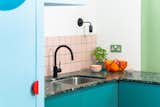
The kitchen backsplash features pink square Domus tiles framed by turquoise blue Mapei grout. The blue grout echoes the tones of the pale blue pantry and the teal cabinetry.
Another challenge was breaking the newly open space into different functional zones. "We did this with the bespoke furniture pieces, which are like characters—Tamsin refers to the pantry as another member of the family," says Stewart. Each piece is designed to fulfill numerous purposes for the family, negating the need to fill the space with furniture.
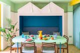
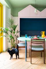
The pink bench enclosure with blue upholstered cushions is a place for the family to nestle and relax. The large mint-green table in the dining area is from Artiform’s Palladio range, and the large yellow Strom jug was designed by Nicholai Wiigh Hansen for Raawii.
The pink bench with a crown of peaks by the dining table, for example, provides seating for family meals, storage (for the kids below and for the couple up top), and a comfy spot for the adults to retreat while the kids watch television in the upstairs living room. "They also usually host a lot of dinner parties," says Stewart. "The crown gives a sense of importance to the bench and frames the people within it." Similarly, the blue pantry in the kitchen functions as both storage and a practical lighting unit, with a projecting "nose" that illuminates the worktop.

The curved blue kitchen larder has a projecting "nose" that illuminates the worktop and a mirrored eye that "winks" each time the door is opened.
The renovation isn’t just about color and form, though. Tamsin is the founder of the online fashion rental subscription service, OnLoan, which has a focus on sustainability. She wanted to apply this principle to the design of her home.
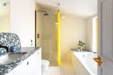
The marbled countertops in the ground-floor bathroom are by Smile Plastics, a company that melts and reuses discarded milk bottles and chopping boards.
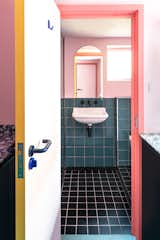
The shower room and WC on the lower ground floor is accessed via the utility room, which also features counters by Smile Plastics.
Shop the Look

Accordingly, the countertops in the utility room and two bathrooms are crafted using a material from Smile Plastics—a company that repurposes waste such as chopping boards and milk bottles. The kitchen worktop is a terrazzo made from marble offcuts laid in pigmented cement.
The kitchen work surface is crafted from terrazzo from InOpera, a company that reuses marble offcuts.
For a project with such a bold visual identity, it’s perhaps surprising that the most expensive parts of the project are essentially invisible. "Fixing the rising damp ate into the budget a lot," says Stewart. "We also had to rewire the whole space and put a steel beam in place of the structural wall. We made sure the things we needed to do to the space were done properly to secure its longevity, and spent what was leftover wisely."
The new pink-and-yellow banister features red circular "eyes," and the colors match the round yellow ROO light switches from Swtch.
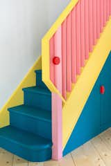
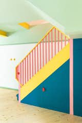
An angular yellow handrail folds over to meet a pink newel post, joined together by a red circular button. The stair is painted deep blue to accentuate its presence in the room.
To make the most of the £73,000 budget, Office S&M remodeled the space as little as possible, and they reused elements when they could. The original staircase, for example, has been refurbished with a new banister and colorful paint. The carcasses of some pieces of furniture were reused, and the services were largely left in place. "Office S&M made magic happen on our limited budget," says Tamsin.
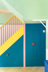
Throughout the kitchen and dining spaces, the ceiling is painted in Dulux Wellbeing green. This continues along the underside of the staircase to help accentuate its form. The cupboards beneath the stair are painted in a deep blue, with circular red finger pulls. The couple’s son, Mo, uses the small cupboard as a hiding spot. "You spend so much time thinking about people and how people will use the space," says architect Catrina Stewart. "It’s amazing to walk in and often be surprised at how pieces are evolving as the kids grow up."
"We see color as a kind of building material that is as important as bricks and mortar," says Stewart. "It can also be incredibly economical—the cheapest thing you can do to transform a space is to paint it, and it can have such a big impact on people’s lives and how they experience a space. We feel it’s a missed opportunity."

The colorful, geometric tableware echoes the larger furniture pieces in the kitchen, which in turn echo buildings in the city. Splatter plates from Granby Workshop contrast with the mint-green Palladio table. "The home is in a very vibrant area with a great market that is incredibly lively and colorful," says architect Catrina Stewart. "Every day during the project, I would pass through the market—and inevitably some of the colors were inspired by the fruits."
"We asked for ‘not boring,’ and boy did Office S&M deliver," says Tamsin. "Our kids adore the space—from their secret storage spaces to the fun use of mirrors. The colors bring me joy on a daily basis—not least during lockdown! And, as a family, we feel like they really listened to our desire for a creative, playful home."
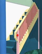
Illustration of stair for MO-TEL by Office S&M

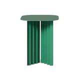
Table study for MO-TEL by Office S&M
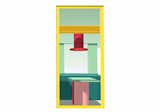
Illustration showing the view from the garden of MO-TEL by Office S&M
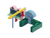
Axonometric drawing of the kitchen and dining area furniture of MO-TEL by Office S&M

Axonometric drawing of the lower ground floor renovation of MO-TEL by Office S&M

Kitchen studies for MO-TEL by Office S&M
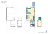
Before and after floor plans of MO-TEL by Office S&M
Related Reading:
Published
Last Updated
Get the Dwell Newsletter
Be the first to see our latest home tours, design news, and more.