Periodic Table of Typefaces
But Wilde has done his homework, and his re-jiggering of the pseudo-zoological way fonts are classified humanizes a subject that can appear stodgy or irrelevant to non-professionals: Only a chemist could love Molybdenum, and only a designer could wax poetic about News Gothic.
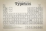
Hydrogen's spot on the original Periodic Table is occupied by the most elemental of typefaces, Helvetica; down in the radioactive netherworld of Unnilhexium and Unnilpentium are fancy-pants fonts like Zapfino and Mistral. And in the space normally occupied by old-school poisons like lead and radon, are the notorious so-called "Nazi fonts" of the Blackletter family – which were really nothing of the sort. (Blackletter was in use throughout Germany before the Nazis came to power, and was later banned by them as too "Jewish." It was also used by GM for the bad-ass lettering on special editions of the Pontiac Trans Am of in the 1970s.)
Fonts in "The Periodic Table of Typefaces" are arranged by family, and according to their ranks on a series of "Best Of" font fave lists from around the design world. The most interesting of these sources is Fontshop's 100 Best Fonts, a website and downloadable brochure (all in German) that includes a history of each font and a biography of its designer, along with the top ten lists from of an impressive international jury, including legendary American designer Roger Black.
In college, I spent an internship working for Black (or at least in his vicinity) at a short-lived magazine in San Francisco, and it was there that I learned there were more than the three fonts available on my Mac SE—and where I first heard adults discussing the merits of serifs with intelligence and a hint of passion. Similarly, "The Periodic Table of Typefaces" could be a great educational tool: Rather than a pull-down list in Microsoft Word, "The Periodic Table" treats typefaces as artworks with an author and provenance. Not a bad way to introduce the kiddies to the idea that fonts are not naturally occurring elements, but rather tools made by people, to be used by people, to communicate with other people.
Published
Last Updated
Get the Dwell Newsletter
Be the first to see our latest home tours, design news, and more.