The Best Scandinavian-Inspired Paint Colors for Your Home, According to Experts
Nordic design, with its emphasis on cozy simplicity, has an undeniable allure whether you live immersed in nature or in a towering high-rise. Likewise, the soft and saturated colors that define the region can help create a Scandi-inspired ambiance at home.
What makes Nordic paint colors so enticing? "It’s the variety," says Charlotte Cosby, the head of creative at Farrow & Ball. "There are so many colors around Scandinavia—in nature, in the colorful cities, and in the wooden houses of the Norwegian countryside, which are outside of the realms of gray and white, which we heavily associate with Scandinavian style."
Farrow & Ball’s India Yellow is part of the brand’s Nordic Edit, a 24-color collection curated by Danish design house Tapet-Cafe.
For Donald Kaufman, founder of Donald Kaufman Color, the region’s relationship with light makes it a uniquely beautiful and inspiring place. He shares what he recalls from visits to Sweden during high season: "The light was at its peak, and everything was gorgeous. The climate makes certain colors more popular than others. The ruling logic in Nordic countries is light, and how it transforms throughout the year."
To recreate the Scandinavian style at home, Kaufman suggests working with cool colors and painting limited amounts of bold shades on subtle pieces of architecture, such as a door or wainscoting. "It doesn’t matter so much about the color itself because if it’s a good color—something a little more interesting—then it can work very well as a contrast with white," he says.
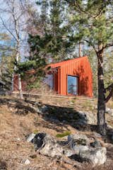
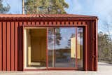
Architect David Salmela designed a bold red staircase viewable through expansive windows, which matches the metal roof of a nearby cabin.
Nordic paint colors work best in tandem with natural wood tones, too. In a historic Swedish village, Kaufman noted the patinated beauty of worn wooden floors. "It was so quiet and beautiful and informative," he says. "The first thing we noticed were the floors, which are made out of wonderful, raw, wide-plank boards and scrubbed by the residents from the 18th century onward to clean them. Of course, you are creating a totally natural material that has not been touched by industry finishes."
If you wish to pay homage to this beautiful corner of the world, it’s as simple as honoring materials from nature and selecting an interior or exterior paint color. Read on as top architects, designers, and paint experts share their tried-and-true Scandinavian shades.
Traditional Reds
Falu (Or Falun) Red
Stockholm’s David Lookofsky of Lookofsky Architecture chose a traditional Falu Red for the exterior of his Monochrome House. "The color was used to connect the house to the surrounding context that is dominated by Falu Red-colored houses," says Lookofsky. "Equally important, though, was the widespread availability of windows, metal flashings, gutters, and downpipes in the Falu Red color. This made it easier to create the contemporary monochrome and distilled facade expression that was an important part of the design."
The pigment in the Falu Red paint is a bi-product of iron ore mining, Lookofsky says: "It is very common in Sweden and has a long tradition."
Benjamin Moore, Red
"Painting wood floors is a common practice in Scandinavia, as is the use of vibrant primary colors to brighten and enliven a home during the darker months of the year," says David Salmela of Minnesota-based firm Salmela Architect. "In this case, we painted the stairway a deep, vibrant red to create a dynamic focal point from both the interior and exterior. The red is a slightly brighter and more saturated variation of the quintessential Swedish Falun Red."
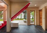
The staircase is painted Red by Benjamin Moore, which serves as a jolt of energy against the tones and textures of natural wood.
Benjamin Moore, Deep Rose
Capturing the Nordic spirit, Minneapolis architects Christine Albertsson and Mark Tambornino of Albertsson Hansen Architecture paired a rich red trim, Deep Rose, with an iron ore–inspired shade, Night Horizon. "These colors are Scandinavian in spirit, in that the red adds a cheery brightness. The dark brown, almost black color is reminiscent of the pitch commonly used as a wood preservative in Scandinavia," Albertsson says.
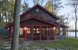
A nearly-black brown was used on shingles and siding, making the exterior particularly Nordic in situ amongst trees and water.
Jewel Tones
Benjamin Moore, Yellow Oxide
Heide Hendricks and Rafe Churchill of design and architecture firm Hendricks Churchill captured Scandinavia’s warmth and vibrancy in the form of a spare New England farmhouse. Painted in stand-out shade Yellow Oxide, the home feels at home amongst the trees. The residence’s use of pared-down millwork and bold, contrasting paint colors feels reminiscent of both the rural American vernacular and the colorful merchant houses of Norway.
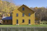
Shades of ochre yellow enliven the exterior and interior of the home, which is situated on 125 acres of land in Sharon, Connecticut.
Farrow & Ball, Babouche
On the interior, Hendricks and Churchill combined bold blue doors with vibrant, shaker-style cabinetry in cheery Babouche. As part of Farrow & Ball's Nordic Edit, Babouche exemplifies the joyful, colorful spirit of the region, particularly when used in combination with natural soapstone countertops and butcher block.
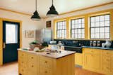
Babouche, a color from Farrow & Ball’s Nordic Edit, is joyful and unexpected beside contrasting soapstone countertops and Hague Blue–painted doors.
Farrow & Ball, India Yellow
If a saturated mustard shade suits for your Scandinavian-inspired space, Crosby offers another bright alternative. "One of my favorites from our core collection is India Yellow," she says. "It feels so earthy and seems to capture a cozy quality in the winter and something uplifting in the spring and summer months."
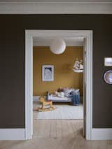
India Yellow is best paired with light molding and contrasting wall colors, such as Tanner's Brown or Off-Black.
Farrow & Ball, Mere Green
If you prefer a deeper Nordic palette, Crosby suggests Mere Green. Farrow & Ball describes this shade as a luxe teal that "bursts with energy, making it ideal for the contemporary home." Throughout Scandinavia, saturated greens are seen as popular interior options and exterior trim colors for yellow and red timber houses.
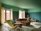
For a modern take on Scandinavian style, Farrow & Ball’s Mere Green is paired with Arsenic on the ceiling.
High Contrast Shades
Benjamin Moore, Black Beauty
For contemporary Scandinavian residences, architects with firm 10K Architecture recommend Benjamin Moore’s Black Beauty. "The home was designed to be minimalist with clean lines, simple forms, and bright and airy spaces," says architect Chad Haller of the sleek family residence. "The exterior was intended to have a stark contrast with the winter snow and to accentuate the purity of the simple forms of the home," he says.
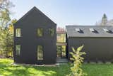
A uniform exterior color brings attention to the surrounding natural beauty, as well as the architectural form and simplicity.
Benjamin Moore, Decorator’s White
Stepping inside, visitors are greeted with a fresh, clean interior swathed in a consistent bright white. "The interiors are almost entirely Decorator’s White, with the only change in color occurring where there is a change in material," Heller says. "It lacks the yellowish and pinkish tones of many other white paint colors and thus provides a neutral minimalist backdrop that allows the textures and patterns of the accent materials such as brick, stone, tile, and white oak to shine."
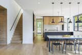
"The interior, in stark contrast, is all about providing an airy, cozy, and bright environment," Heller says.
Atmospheric Neutrals
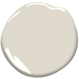
Donald Kaufman Color, DKC-84
Kaufman suggests exploring dark white shades for Nordic-inspired interiors, particularly DKC-84, which he calls their darkest neutral white. "We’re able to put a full spectrum of pigments into a white, and with darker versions, you have more pigments interacting to create a more luminous color," says Kaufman.

Kaufman describes DKC-84 as "a dynamic white that is as dark as we could make it, and have it still be neutral."
Benjamin Moore, Fog Mist and Chantilly Lace
Nivara Xaykao, color marketing and development associate manager with Benjamin Moore notes that traditionally, Scandinavian design has revolved around shades of white, gray, and blue. "However, a worldwide phenomenon like hygge, has unveiled the softer, more rustic side of Scandinavian design with warm, cozy neutrals like Chantilly OC-65 and Fog Mist OC-31," she says.
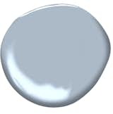
Benjamin Moore, November Skies
In addition to soft neutrals, dusty pastels and bolder blue-grays are growing in popularity, as well, Xaykao says: "A few paint colors that encapsulate these different sides of Scandinavian design include Metropolitan, November Skies, and Teacup Rose."
Farrow & Ball, Teresa’s Green
For an upstairs bedroom, Hendricks Churchill expertly combined lime plaster walls, high-gloss floors, and Teresa's Green trim, resulting in an ethereal, seafaring atmosphere. While the name says green, it is categorized as a mid-aqua, with a rich blue base and delicate green undertones.
Like many Farrow & Ball shades, expect Teresa's Green to change from green to blue and back again depending on the light. The spare, farmhouse trim pairs beautifully with glossy Cornforth White floors.
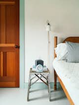
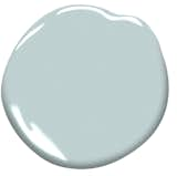
Benjamin Moore, Harbor Haze
According to Xaykao, "The purity of color at the center of much of the Scandinavian palette works so well with light and can make a room feel fresh and cheerful." Harbor Haze is particularly refreshing with its cloud-like undertones and cheerfulness, she says.
Cover image by Mattias Hamrén.
Related Reading:
Published
Last Updated
Topics
How-To & GuidesGet the Dwell Newsletter
Be the first to see our latest home tours, design news, and more.