Collection by Stephanie Orma

Matthew Carter's New Typeface

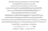
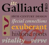
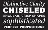
Matthew Carter has a letter for web designers, typography geeks, and design buffs everywhere. Actually, he has a whole brand spankin’ new alphabet. On February 2nd, the iconic type designer unveiled his newest commercial typeface, Carter Sans, at the Book Club of California in San Francisco to the delight of more than 80 graphic design glitterati. In a fireside-like chat with Editor/Designer Patrick Coyne of Communication Arts Magazine, Carter shared the behind-the-scenes story of his new typeface, his bemused thoughts on Ikea “scandalously” switching their catalog design from Futura to Verdana, and how the John Coltrane Quartet rocked his typographic youth. Plus, with far more typefaces than ever now being produced for the web (including Carter Sans), he jestingly added, “web designers can finally stop blaming me for their boredom with Georgia and Verdana.” Although the world’s most accomplished typographer doesn’t consider himself to be an artist, the Museum of Modern Art—who recently acquired several of his widely used typefaces for their permanent collection—seriously begs to differ. And so do we. Click through the slideshow for highlights of the inspirational evening.

Don't miss a word of Dwell! Download our FREE app from iTunes, friend us on Facebook, or follow us on Twitter!

While designing the typeface, Matthew Carter (pictured right) collaborated with Dan Reynolds (left), a talented senior type designer at Monotype Imaging’s Linotype subsidiary. After first seeing Carter Sans during a meeting in October 2008,  Reynolds was “immediately interested and started pestering some people to get involved.” Along with drawing the bold italic and small cap fonts, he oversaw character development and production. Image courtesy Monotype Imaging / Jim Wasco.
While designing the typeface, Matthew Carter (pictured right) collaborated with Dan Reynolds (left), a talented senior type designer at Monotype Imaging’s Linotype subsidiary. After first seeing Carter Sans during a meeting in October 2008, Reynolds was “immediately interested and started pestering some people to get involved.” Along with drawing the bold italic and small cap fonts, he oversaw character development and production. Image courtesy Monotype Imaging / Jim Wasco.
Following Carter’s Q&A, Reynolds presented the intricate details of the new typeface to an attentive room of leading design professionals. He summarized the discussion best in his closing remark, “Typefaces are really just tools and don’t come alive until people start to use them.” Image courtesy Monotype Imaging / Jim Wasco.
Although unintentional in design, Carter acknowledged there were some similarities between Carter Sans (shown here) and Verdana. He also added that he “must have been the only person on the planet not to receive the Ikea Catalog” when news of their change from Futura to Verdana broke. His reaction? He found it “curious reading some of things people said about how it had been designed – I couldn’t believe it. They were saying things like Verdana was a flat-pack typeface – like when you buy things from Ikea and it comes in a flat box and have to put it together yourself – sort of the indication that’s how Verdana was made. My god if there was any typeface that was built from the ground up it was Verdana – so I was bemused by all this.” Image courtesy Monotype Imaging.
As Carter shared highlights from his prolific career, he divulged how the music of the John Coltrane Quartet had a profound influence on his early typographic years. Growing up in a British “typographically privileged home” with his father a typographer, Carter was full of self-confidence starting out. But a trip to New York opened his eyes to a new world of mind-blowingly talented graphic designers that shook his confidence to the very core. But after seeing the John Coltrane Quartet perform night-after-night with such intensity, pushing themselves harder rather than coasting on their successes, gave him the emotional lift he needed to embrace his fears, move to New York, and become the extraordinary typographer he is today. Image courtesy Monotype Imaging / Jim Wasco.
Carter’s ITC Galliard is just one of several of his typefaces to be acquired by New York’s Museum of Modern Art for their permanent collection. In his talk, he discussed how typographers sit at the bottom of the design food chain and that, “There aren’t very many design authorities that treat type design on par with other forms of industrial design.” Thus, he couldn’t be more delighted with MoMA’s request. Image courtesy Monotype Imaging.
Renowned design firm Pentagram was the first to use Carter Sans in their typographically-driven invitations for the November 2010 Art Directors Hall of Fame Gala (a “who’s who” in the advertising and design industry). The elegant typeface was featured in all their campaign materials. Image courtesy Monotype Imaging / Pentagram.

Don't miss a word of Dwell! Download our  FREE app from iTunes, friend us on Facebook, or follow us on Twitter!
Renowned design firm Pentagram was the first to use Carter Sans in their typographically-driven invitations for the November 2010 Art Directors Hall of Fame Gala (a “who’s who” in the advertising and design industry). The elegant typeface was featured in all their campaign materials. Image courtesy Monotype Imaging / Pentagram. Don't miss a word of Dwell! Download our FREE app from iTunes, friend us on Facebook, or follow us on Twitter!