Chiswick House
Credits
From Longplain
When a London family purchased a new home in Chiswick, in the heart of a Conservation Area, the property was pleasant but unremarkable. It was very much of a type, fitting easily alongside its neighbours as part of a row of well-maintained, two-storey terraced homes, with some, as this one, also featuring attic conversions. The inherited interior was cosy and family-oriented, with warm, Victorian-era paint colours and plenty of comfy furniture. Book cases and ornaments lined the walls.
And now? The front of the house is pretty much identical, albeit carefully restored, with the door still featuring its beautiful, stained-glass display centrepiece, but, inside, the property is almost unrecognisable. The new interior, created as a successful team effort between the owners, designer Lindsay Bell of Longplain and lead contractor Syntec, is a minimalist dream: cool and airy, bright and white, rationalised and smooth and featuring new, boxy extensions to the kitchen-dining room and loft.
Endless, space-enlarging white volumes and tactile wrap-around timber are the scheme’s two signatures across a series of spaces that that lead effortlessly one to the next, whilst a sparingly-used secondary palette of black metal, black timber, black and grey tiling and an occasional surprise snap of bright yolky yellow add necessary contrast and punctuation. Remarkably, for a transformation that has only increased the internal volume by 3 sq m, the feeling of space afforded by the new internal arrangement suggests an entirely different property.
The story begins:
When the owners, a portrait/interiors photographer and a financial consultant with a specialism in design and construction, plus their two children (one school-age and one almost ready to leave the nest), first moved in, they lived in the property for a year almost unchanged. In spite of itching to get to work on it, they limited themselves instead to painting the walls white, doing all the necessary updating to the wiring and plumbing to ensure the house functioned as well as it could, whilst giving themselves time to consider how hey wanted to live in it, how the spaces needed to function and which products and finishes might suit both it and their personal aesthetic vision.
How they wanted to live was already clear – openly and without barriers, in a home designed for robust family life and featuring plenty of kitchen-table entertaining. They also knew they wanted easy access to the garden, where the existing design, so right for their predecessors, was far too busy and crowded for their tastes.
Finally, and cautiously, they decided to start with a major revamp of the kitchen-dining space. And then the loft. And the garden too. And then, because everything turned out to be interconnected and also because the back of the house turned out to be falling away once it was opened up for preliminary works, they began to talk to their designer, Lindsay Bell, Creative Director of Longplain (who had also worked on their previous property) and to contractors Syntec, about a bigger vision. In the end, the entire house was revamped, working in what the owners called ‘a very positive and solution-based journey with three sets of people always on the same side.’
The brief:
The brief for the remodelling of the property was based on five clear design principles:
Generosity – volume was all to the owners and so the first principle was to maximise space and enjoy the luxury of super-sized dimensions wherever possible, such as the incredible, new, floor-to-ceiling-height doors that lead into the lounge - or the 9m-long credenza and interconnected storage unit that runs the full length of the lounge/study space.
Clean Lines – to achieve the perfect balance between copious amounts of storage and the clean lines required by the clients, together with a stipulation for zero surface clutter (in the kitchen area, even the toaster and breadbin now have their own pull-out section, whilst the cooker hob is recessed to maintain the seamless top line of the prep surfaces.)
Common Language – for each space within the house to speak to other spaces, establishing a clear commonality throughout.
Simplicity – for a sense of restraint to dominate, so that all of the well-chosen, dramatic elements could really take their place on the stage.
Surprise – lastly, for there to be surprises throughout, via the use of colour or clever detailing.
The new design in detail:
‘Our overall aim was to marry the new and the old in this project’, Lindsay Bell commented. ‘We were looking to give an old house a second chance by respecting the streetscape and the original construction period, whilst internally stripping back all the layers added over the decades to enable us to demonstrate just how adaptable the property could be for thoroughly modern living’.
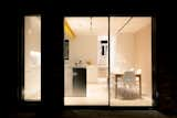
The kitchen-dining room – the hearth and hub of the home – was the single most complex and most important space to get right. Externally, planning stated that the pitch to one side of the house (with the house already extending out at the rear in a narrower-footprint, two-storey extension as part of the original design) had to descend, as part of the proposed newly-wider design for the rear, to a 2m-height at the far edge of the property. The owners, at the same time, were very clear that the interior of this key space should be a clean box shape that maintained height throughout, without an angled ceiling. Longplain’s solution was to configure the design in such a way that the inner space remained a box, whilst the angled pitch was disguised by its location within a wall of kitchen cupboards.
A further complication arose from the gable wall on the other side, which angled in slightly, as the rear of the house is 300mm narrower than the front – again, not ideal when the clean geometry of a box was required. Longplain’s compensatory angled walls work like all good illusions do, with Syntec’s construction skills key to achieving the required dimensions throughout this space to surmount this problem.
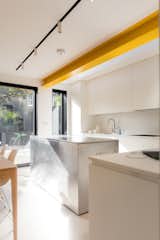
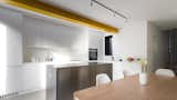
Maintaining the steps down to the kitchen from the rest of the ground floor, meanwhile, whilst deepening them slightly, allowed both for superior drainage solutions, as well as the installation of underfloor heating beneath the new, grey-toned, poured resin floor. A new steel i-beam that runs the full depth of the kitchen is painted in a bright egg-yolk yellow – a fun note in the scheme that finds an echo on the staircase to the upper floor of the house, where a storage cupboard also has a large, yellow-painted metal door.
Lighting in the kitchen is in the form of 12 lights, arranged in fours on three tracks and set inside black-painted recesses. Only two of the three tracks are instantly visible, with the third, which directly lights the food prep area, carefully hidden between the i-beam and the upstand for the new kitchen rooflight, which brings additional natural light into the space.
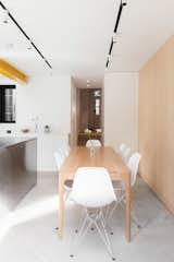
Furniture in the kitchen-dining space includes a brushed stainless steel island, bespoke-designed by Lindsay Bell of Longplain for the space and featuring inset drawers with sub-sections for various cutlery items. The dishwasher is also ‘hidden’ within the island. The kitchen wall units were also bespoke and are finished with a matt lacquer spray and illuminated at their downward-facing edges with recessed LED downlights. The left wall of the kitchen is clad in maple play, allowing the introduction of a natural element and linking to the timber used throughout the common parts of the house. Maple play was also used to clad all the interior surfaces of the newly-extended loft space.
Plenty of storage ensures surface lines are completely clean, with even the cooker hob recessed in order not to protrude above the counter tops, with the extractor also concealed within the base of a cupboard. An angled ‘Le Mans’ shelf in the corner cupboard makes the best use of space and houses pots and pans. Taps which provide both boiling and filtered water ensure no kettle is needed and signal an end to the use of plastic water bottles in the household. The only freestanding furniture items are a long thin timber table by Barber Osgerby, ensuring easy flow around the space, plus six white Eames chairs from Vitra.
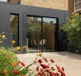
To the rear of the kitchen, full-height, 2.2m x 2.4m sliding doors open onto the garden. These were created with the thinnest possible profile, with added visual depth created by a black, powder-coated aluminium frame. Inserting a lock along the bottom panel, rather than on the vertical axis, also permitted a thinner profile. The doors now open onto a completely-redesigned garden area, bordered by a high, black-painted timber fence that creates a definitive surround and serves as a great backdrop for planting. The fence speaks the same materials language as the ground-floor level external timber cladding to the extended kitchen-dining space and also links to the black metal of the deep, picture window frames to the interior.
‘The garden was not a clean shape at all’, the owners explained, ‘and another of Lindsay’s great suggestions was to create a rear garden storage area for clutter. Now, the garden is a very clean rectangular shape, whilst a flush-fitted door to the rear opens onto a narrow-angled space, where all the kids’ toys and garden implements can be kept out of sight’.
The surface of the garden area is stone, with a continuous bed to either side. The bed to the left has tall and striking bamboo planting, whilst the opposite bed features a more eclectic mix of wilder, lower-height plants. Lighting at the edge of the beds, for night-time illumination, includes eight Bega Lights and three moveable spotlights. To make sure the space works for everyone in the family, a series of three ‘grass’ rugs can be rolled out across the stone for whenever the couple’s youngest child wants to play out. A further incidence of slightly eccentric compromise is the rectangular hole to the left-side of the fence - a friendly gesture to ensure the family’s next-door neighbour didn’t lose any sunlight through the new height of the fence.
‘In London, we all live cheek-by-jowl with other people and accommodating their wishes is always a long-term wisdom!’ the owners commented.
Whilst the inner back wall of the kitchen had once been linked to the rear of the lounge, the new owners decided to dispense with this and maintain instead a small courtyard, so that services could be arranged as efficiently as possible, with optimum fresh air circulation a priority.
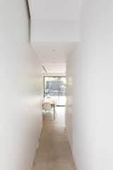
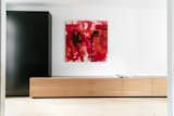
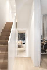
The kitchen is linked to the rest of the house instead via a long hallway, with white walls and flooring in engineered oak. Full-ceiling-height white doors lead into the lounge/study area and create a sense of drama and grandeur, becoming part of the structure and blurring the hallway-lounge boundary. The lounge space is long, slim and airy and is effortlessly zoned into a seating area; a ‘gallery’ area (currently housing one large piece of art) and a study/office area, with the joinery wall uniting them all, made up of a bespoke, 9m-long credenza unit in book-matched oak and ending alongside the office desk in an interlocking tall black cupboard. The desk in the study area is by Konstantin Grcic and comes from SCP, whilst the timber slatted statement pendant light at the front of the room is from twentytwentyone (with a smaller version also used upstairs in the daughter’s first floor bedroom – another example of the ‘conversation’ between individual spaces in the property).
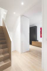
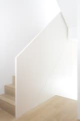
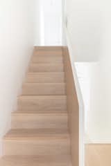
The house’s new staircase is a major feature of the new design. On the ground floor level, its base conceals both electrical distribution boards and a guest cloakroom.
‘As the stair void was only 1600mm wide’, Lindsay Bell explained, ‘we worked closely with Syntec to create a very slim profile structure for the balustrade, so that the structure could be slotted into the existing space and maintain an impeccable, clean look in a house that has this distinct kink in the journey from front to back!’
The staircase features solid oak nosings and treads in engineered oak, with the exterior face and top of the balustrade spray-painted white and the inner face clad in oak veneer. At first floor level, to avoid awkwardness, the classic ‘goose neck’ stair turn was removed altogether, so that the separate slices of the balustrade stand free.
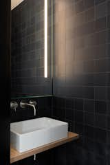
Located on the first floor are three bedrooms – a master room, with its own door and en suite bathroom; the daughter’s room and a guest room or room to use when the older son comes to stay (he’d left home by the time the project completed). The bathrooms, which include a ground floor guest room, two on the first floor and one in the loft space, run in a spectrum of dark to light tones, bottom to top, with the tonal gradation starting in the ground floor bathroom, clad in Barber Osgerby wall tiles from Domus in 15 different shades of black, which are arranged in a seemingly random arrangement. On the first floor, the bathroom wall tiles are a mid-grey, arranged horizontally in a Japanese bond style, whilst the top floor bathroom tiling is all in white. Sanitaryware in all four bathrooms includes Laufen sinks and brushed, stainless steel taps.
The master bedroom also has a full wall of storage, with custom-made full-height doors in a natural, earthy colour – a subtler version of the egg-yolk yellow highlight colour. It’s the only bedroom to feature oak flooring, with all other bedrooms carpeted. Feature lights in the guest room are ‘Nude’ pendants, sourced from SCP. The daughter’s bedroom features painted walls in a shade of pale greeny-blue, which she selected herself.
The final floor houses the studio space for the photographer owner to work in, which has been extended beyond the original V-shaped space that sat within the rafters to more add more space and light, with particular assistance in this space from Syntec, in terms of maximising interior volume within the conservation area planning requirements and also for the meticulous cladding throughout in maple ply, which now makes the studio a perfect backdrop for photographic shoots.
------ ENDS --------
Photographer Credit: Sirli Raitma
www.sirliraitma.com
Architectural Design: Lindsay Bell, Creative Director, Longplain
www.longplain.co.uk
Main Contractor: Syntec
www.syntec.uk.com