Interior renovation of a classic Dutch house
Details
Credits
From Camilla Casiccia
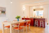
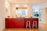
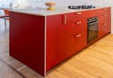
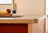
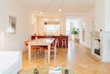
The details of this old classical Dutch house, which embody its beauty, were not to be touched in the renovation of its kitchen and living area. Indeed, they were the first elements to inspire the materials and color selection for the design. The red of the island purposely matches the red in the glass doors, and at the same time, with its stainless steel top and oak details, it generates a modern element that rejuvenates the entire living space.
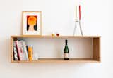
The new kitchen components occupy the precise space where the original kitchen's walls once stood, ensuring that the existing floor seamlessly envelops the new volumes. The white back wall of the kitchen serves as a partition from the adjacent room while allowing natural light to filter through the central window. Low installed wall shelf and low furniture were thought to increase the feeling of height of the entire room, resulting in a very spacious and minimal living. Bright colours and objects define the rest of the space infusing it with a fresh and contemporary feel.
