How They Pulled It Off: A Triple-Leaf Door Creates Visual Privacy
Welcome to How They Pulled It Off, where we take a close look at one particularly challenging aspect of a home design and get the nitty-gritty details about how it became a reality.
They say that knowledge is power, but sometimes it’s what you don’t know—the "known unknowns"—that lead to exciting new ideas. That was the case when Galen Pardee and Manuel Cordero, the founding principals of the architecture firm CoPa, were approached by a couple looking to renovate their house to accommodate aging in place.
Joanna and Michael are both in academia; Joanna is Vice Provost at UC Davis, and Michael is a professor. They were looking to try and stay in their home as long as they could, and wanted to "feel confident and reasonably unencumbered by the inefficiencies of the existing layout," said Pardee.
But the existing home—a typical ranch house located in Davis, California with bedrooms flanking a central living room, kitchen, and dining area — wasn’t designed for efficiency or accessibility. Although it didn’t have stairs to a second floor, the jacuzzi tub in the ensuite bathroom was large and outdated, and the bathroom partitions didn’t go all the way up to the ceiling. What’s more, none of the bathrooms could accommodate a wheelchair.
So Pardee and Cordero developed a simple, surgical intervention on two rooms in the house. First, they renovated the primary bedroom and its en suite bathroom to make it wheelchair accessible. Then, they turned a previously unused office into a secondary bedroom and addressed its awkward angled wall with custom-designed cabinetry.
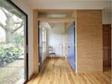
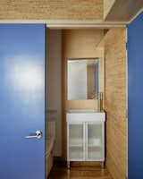
One of the biggest moves in the renovation of the primary bedroom suite was rethinking how the bathroom could be used. "A major goal of the intervention in this space was to remove the bathtub and enclose the toilet and sink to create some visual privacy," explains Pardee. By removing the tub and selecting more space-efficient bathroom fixtures, suddenly the space opened up—and a sitting room in front of the bathroom was created.
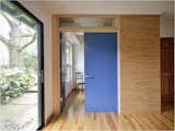
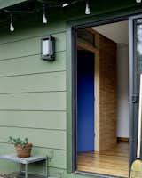
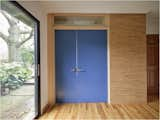
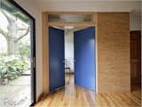
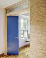
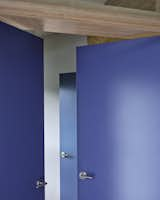
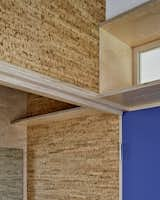
To access both the sitting room and the bathroom, CoPa designed a unique door with three leaves, one of which serves two openings—meaning that when it is paired with the door to the sitting room, it encloses that space; and when swung inward, it is paired with the other bathroom door to enclose the bathroom. The three door leaves, with their simple, accessible lever door handles and bold blue color, are playful and practical, providing (along with the now full-height partitions) privacy and access.
How they pulled it off: A big, blue, triple-leaf door
- The doors are standard heights and widths; the only custom components are the door frames, which are made out of plywood and allow the central leaf to move between its two "closed" positions.
- Emtek door hardware, which can be purchased off-the-shelf, was used. Roller catches on each frame hold the leaves in place and the team was able to use standard three-knuckle hinges.
- The doors are painted Sherwin Williams Georgian Bay after consulting with the clients, who wanted something deep and calming.
- Part of what allowed this design to be achieved was the open and collaborative approach of the contractor, who was "very game to experiment," notes Pardee. "It took a lot of back and forth with the door vendor to get them to understand what we were asking for, but they were great advocates for the project and were able to craft the door jambs and headers so that all three leaves can lock into place exactly as if they were a set of regular doors."
Tied to the homeowners’ unknown timeline for retirement was also the possibility of potentially selling the home down the line, in which case it was very possible that a new homeowner would remove the renovation. This instigated an approach of using reusable or, as Pardee notes, biodegradable or recyclable materials—"the responsible choice to ensure minimal waste." Cork was selected as both a finish material and wall cladding instead of drywall for a host of reasons: it could be "de-mounted from the framing and potentially reused or allowed to biodegrade, while also avoiding excessive construction dust and eliminating the need for paint or sealers," he says. The natural patterning of cork provided visual interest, and ended up being a springboard for the selection of the other two primary materials: maple plywood and blue paint.
Instead of drywall, which is typically installed using metal screws, taped, and then skim coated and painted, the cork is fastened to the studs with small brads. This mechanical fastener allows the tiles to be "demounted" without glue or other adhesives that could compromise their biodegradability, should the house be sold and the walls removed.
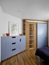
A similar material palette was selected for the custom cabinetry in the secondary bedroom. Cork clads the new built-out closet, maple plywood forms the shelving and the countertop over the set of drawers, and then the drawer fronts and the sliding barn-style door to the closet are finished in a warm light blue—distinct from the darker blue in the primary bedroom, but a similar shade that also provides a nice contrast to the other, more neutrally-toned materials.
Published
Last Updated
Topics
How They Pulled It OffGet the Dwell Newsletter
Be the first to see our latest home tours, design news, and more.
